How to Create Marketing Graphic Banners with Photoshop that Get Great Results!
We live in a graphic world.
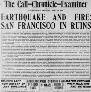 One hundred years ago, people–who could–read. And they read a lot. Long books. Gray, type-heavy newspapers.
Even a spectacular news story like the 1906 San Francisco earthquake and fire that destroyed much of the old city was told in long lines of fine text.
To get the details of the story, one had to invest a little time and read the entire thing.
- Bullets didn’t make it skim-able.
- Sub-heads didn’t break up the text.
- Color didn’t catch your eye.
Reporters learned to write with the most important information at the top of the story and the least important at the bottom. That way, when readers had enough, they could stop any time. Or if a story ran longer than the available space on the page, it could be cut from the bottom.
But over the years, newspapers, magazines and advertising evolved to communicate faster with fewer words, and more images.
People were busy. They didn’t have time to read like they did earlier.
We barely have time to tweet today.
“Just the facts, ma’am, just the facts.”
“Just the facts, ma’am, just the facts,” was Sgt. Friday’s favorite admonition on the old TV program, Dragnet, when a witness would go off on a tangent.
In my 17 years in the newspaper business, editors had to learn how to appreciate if not create graphics to pull out just the facts for the readers because they were reading less. The audience was becoming much more impatient.
Now, everyone is an editor and a publisher. If you have a blog, you must know how to create graphics to communicate the facts fast.
The rules still apply. Readers want to get the information quickly.
That’s why you need to know how to create images like the one below—a banner graphic used on social media, your blog, or in articles elsewhere.
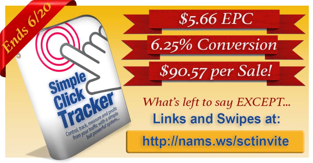 In this case, we needed to “announce” the results of our latest product launch to potential Joint Venture partners before the event was over so we could drive more sales.
The banner graphic had to fit the recommended newsfeed image size on Facebook—1200×628 pixels.
Thank goodness we now have Photoshop as an affordable, versatile and incredibly powerful tool to create graphics quickly.
But when you hear the word “Photoshop,” you might have a little bit of panic roll down your spine.
But don’t worry. It’s not nearly as tough days – or as expensive – as it was in the old days. In fact, it’s an incredibly versatile and powerful tool that you can get for less than $10 per month.
In today’s demo, I thought I’d show how I created a quick graphic in Photoshop that pulled in great results. I created this graphic below in less than 30 minutes. And I’m NO graphic designer!
What’s the goal of the graphic?
With only a couple of days left in the launch, we needed to increase the buzz about the Simple Click Tracker launch to convince JV partners to take another look at this promotion.
It was a higher ticket item for a JVZoo launch—between $47 and $147 depending on the license version.
So, the conversions on the front end were lower, but the Earnings Per Click (EPC), Conversions and Revenue per Sale were excellent.
So, our goals were simple:
- Get the word out!
- Focus on the numbers.
- Make potential partners aware of the deadline.
- Highlight the link to get the promotional tools.
- Create more buzz.
The graphic I created had to communicate fast because it would be seen on Facebook mostly.
That’s a scrolling environment. No one is going to read much of anything. They are looking for something to catch their eyes.
If it works, people will see, be drawn to it, then act on it.
And it worked. On an 11-day launch, 36.4% of our sales came in the last day after we published this graphic
With results like that, you can see the importance of being able to create simple graphics that communicate your message extremely fast.
Nothing is better or more flexible at doing that than Photoshop.
Since it was first introduced on Feb. 19th, 1990, this software has gotten much easier to use, not harder. I should know. I’ve been using it since about 1995.
And in 1995, I probably paid about $1000 for the software. Today, you can get it for less than $10 per month if you subscribe annually.
So, let’s look at how I created that banner
First, I created a new canvas. Think of that as the background for my image. The size was consistent with the Facebook newsfeed—1200×628 pixels.
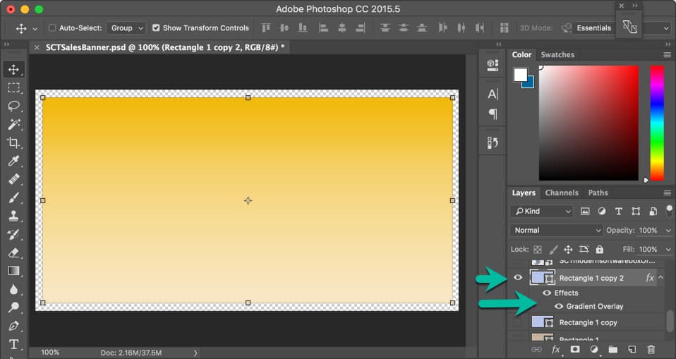
Next, I drew a rectangle using the shape tool.
An important note about Photoshop fundamentals…
Everything is based on layers. And once you understand the layers and how they are stacked in the project, called a .PSD file, you’ll love it.
You can arrange your workspace anyway you like by undocking many of the panels. I like to keep mine together and work in the canvas area—kind of an old school approach.
The layers are loaded in the right sidebar in the Layers panel.
Layers are stacked from top to bottom. The top layer will over the one below. Imagine that we had 5 layers in this order below:
- 5
- 4
- 3
- 2
- 1
Layer 1 would be the background. And Layer 5 would be the viewable text on top. If you moved Layer 5 below Layer 1, the text would be behind the background and not visible.
A layer can be toggled on and off by clicking the eye icon. (See the green arrows.)
My first step was to create Layer 1 – the background. I added a rectangle just a bit smaller than the canvas area. You’ll see why at the end.
With this rectangle, I wanted a gradient background that would act as a not-too-subtle background, but also work with the type colors and other elements. So, I click on the fx button below and added the gradient overlay.
I won’t go into the specifics of how to do that because there’s other great training for that.
Next, I added my Simple Click Tracker software box graphic that I created in another simple program.
I dragged that image from my file explorer right on to the gradient background and gave it about a 15-degree spin by grabbing the image handles. With those same handles, I could resize the image.
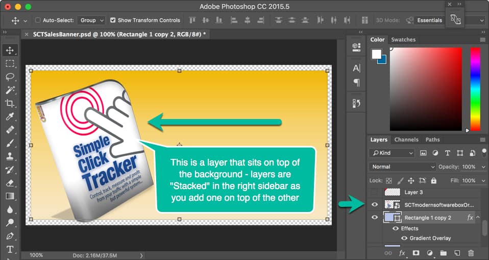
The software box image created another layer that sat on top of the background. Notice the layer in the right sidebar is above the background rectangle.
I had 3 great promotion numbers I wanted to highlight quickly, and I decided to do that by putting text over a red ribbon that “announced” the fact.
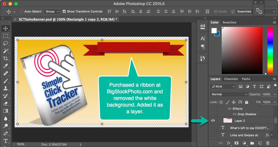 So, I purchased the correct ribbon from BigStockPhoto.com. (I usually buy 100 photo credits there a couple of times a year for about $175. An entire sheet of ribbons of varying sizes and shapes was 1 photo credit so it cost me about a $1.75.)
I drag the ribbon onto the image, grabbed the handles and resized it.
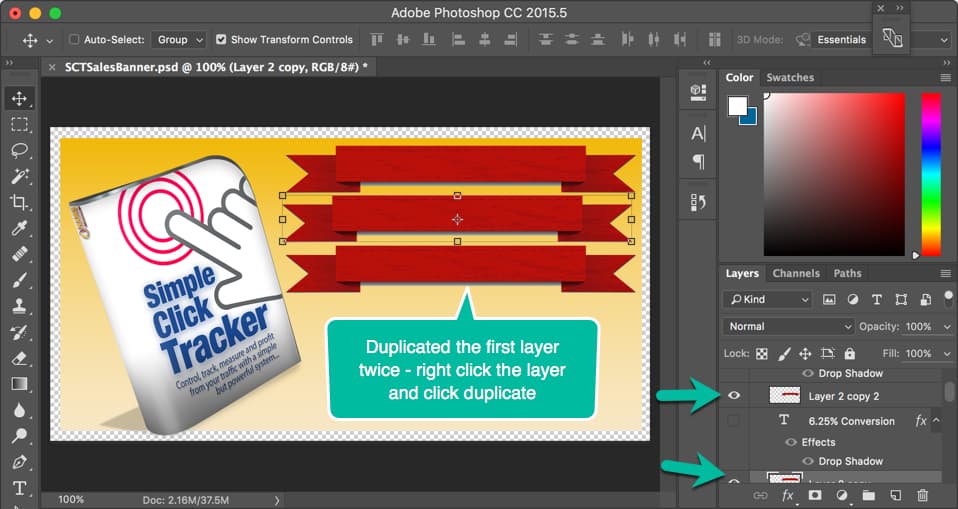
Once I had the ribbon positioned and sized as I wanted it, I right clicked the layer (in the Layers panel at right over the words “Layer 2”) and clicked “Duplicate Layer.”
It automatically created an additional layer with the ribbon in place.
I repeated that process since I had three ribbons, one for each number I wanted to highlight. See the image above.
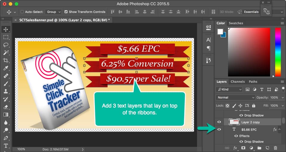
Next, it was time to add the text over the ribbons.
By choosing the text tool from the left tools menu icons (it’s the capital “T” in the left side at the bottom in the image below), I added the first text layer, chose the font, the size and the color.
I duplicated that layer twice and edited the text to add the next two number announcements. Then, I positioned them over the red ribbons.
As you can see, I’m just building up this image one layer at a time.
At first, that can seem a little confusing but once you get the hang of it, you’ll love the ability to turn layers on and off by toggling that “eye” icon in the Layers panel as well as organizing them by folders.
Below, I added a twist by creating a folder for the button because I knew that I could resize, move or edit the entire button at once if it were grouped in a single folder element.
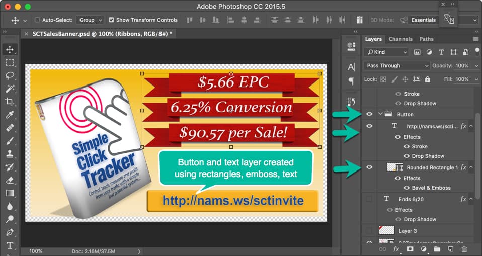
So, you’ll notice in the Layers panel, a folder icon at the first green arrow and the label Button. The “Button folder” contains two elements:
- A rectangle that has been shaped using the emboss effect to look like a raised button, and
- A text layer with a URL added as the text.
This gives the image the look and feel of a clickable link.
That’s good because I want them to click on the image to find the link in the caption. Facebook doesn’t allow clickable images, but you can include the link in the caption and it IS clickable.
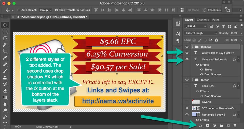
Next, I added two text layers with VERY succinct copy to drive viewers to go to the link in the button.
The text layers were styled using the fx options indicated by the bottom green arrow.
With one more photo purchase from BigStockPhoto.com, I grabbed another ribbon to highlight the corner and added the text layer over that with the ending date for the promotion.
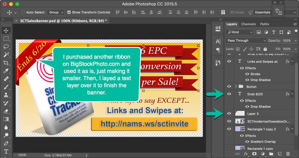
We associate corner ribbons with important announcements like “NEW,” “Version 2.0,” “Sale,” or other timely points. This is no different. I wanted the deadline to get special attention.
Notice how I made the illusion of the ribbon wrapping around the rectangle by making the background just a few pixels smaller than the canvas and adding the corner ribbon completely to the edge of the canvas.
Remember, I did that in the beginning because I had planned all along to have a corner ribbon “wrap” the banner.
The little curl-under effect was already on the corner ribbon when I purchased it, so I had to resize it to fit. When you get it aligned properly, it gives it that 3-dimensional illusion.

Once again, the finished image communicates exactly what I wanted it to say in as few words as possible with the right highlights.
Okay, I buzzed through this pretty quickly.
And yes, there are a lot of little things that you have to learn if you plan to use this incredible tool. I only learn enough to get done what I want to get done. By no means am I a Photoshop expert.
And you don’t have to be either. Once you learn the basics, you’ll zip around in Photoshop and you’ll never go back to your old—and more limited—graphics programs.
This demonstration uses some of my Photoshop skills specifically to show you how I combine graphics and marketing to get results. That’s the key. These skills were simple and easy to learn.
Don’t stop there.
If you want to get really friendly with Photoshop, check out Photoshop Friendly taught by Kelly McCausey and Samantha Angel.
Kelly & Sam are self-taught Photoshop users. They know well the features needed to create web graphics and what areas of Photoshop they’ve never needed to familiarize themselves with. They have an incredible eye for design and a no-nonsense teaching style that you’re going to enjoy.
You’re not going to hear a lot of tech-speak. They’re not going to fly through demos at the speed of light, expecting you to just ‘catch up’. They’re breaking it down into chunks that you can refer back to.
Best reason yet, they’re giving you a chance to submit weekly project assignments for feedback and suggestions for improvement. This is optional but I hope you decide to take advantage.
Click the button below to find out more about Photoshop Friendly training and the next class.


David,
What did you use to create the snap shots of your screen to use in your blog post? Did you use Jing?
Hey Carol – I use Snagit.
Carol – sorry I’m so late replying. I use Snagit from Techsmith. It’s $50 for the software. But you can also use Jing and it’s free until you hit a storage limit – which is pretty big. David
Excellent Henry. I think this is a really valuable tool. I use it nearly everyday. And frankly, you only have to learn what you need to learn at that moment. Don’t be intimidated by PS.